Colour
In this section we explore the carefully selected hues that define our brand identity. Inspired by dynamic landscapes and modern business energy, our colours captivate attention, build trust, and establish a strong visual presence. From primary colours that form the foundation to secondary and accent colours, adhering to our guidelines ensures consistency and coherence across all brand materials.
Main colour palettes
In our brand guidelines, we present four distinct colour palettes to provide a range of visual options for different contexts and moods.
Each palette offers a unique visual language to enhance our brand’s presence and evoke specific emotions in different scenarios.

Lavender
The “Lavender” palette exudes a sense of tranquility and sophistication with its pastel hue.
Lavender
#e7e6f6
RGB:230,231,246
Lavender strong
#B4ABF7
RGB:180,171,247
Lavender deep
#8E82F2
RGB:142,130,242
Cool
The “Cool” palette offers a refreshing and modern feel, incorporating shades of blue to evoke a sense of calm and professionalism.
Cool
#EBF3FD
RGB:235,243,253
Cool stone
#E6EBF6
RGB:230,245,246
Cool water
#C4D9FD
RGB:196,217,253
Dark
Lastly, the “Dark” palette brings depth and elegance, with rich, deep colours that create a sense of mystery and sophistication.
Deep blue
#0F0B35
RGB:15,11,53
CMYK:97,94,45,58
Screen blue
#432EEA
RGB:67,46,234
No print use!
LeadDesk blue
#1E156A
RGB:80,42,100
CMYK:100,100,32,33
Background gradients
Background gradients are used strategically to add depth and visual interest to our brand materials, creating a dynamic and engaging visual experience.
Lavender Strong
Cool Water
Screen Blue
Accent colours
Accent colours are selectively used in supporting graphics to add visual interest and highlight specific elements within our brand materials. These vibrant hues provide an additional layer of dynamism and help draw attention to important information, creating a cohesive and visually captivating experience.
Electric Blue
#5DF2F6
RGB:62,96,100
CMYK:34,0,7,0
Mint Green
#A0FFD4
RGB:37,100,100
CMYK:28,0,27,0
Bright Purple
#DE61FD
RGB:62,99,100
CMYK:26,63,0,0
Dark Purple
#631EA9
RBG:82,66,100
CMYK:76,93,0,0
Primary colour usage
These act as examples on how to use the colours. All primary coors can be used as backgrounds, and secondary colours can act as complimentary by using them for graphical elements and buttons.

Secondary colour usage
These act as examples on how to use the colours. When these are used as backgrounds, headings and paragraphs should always be “Deep Blue.”

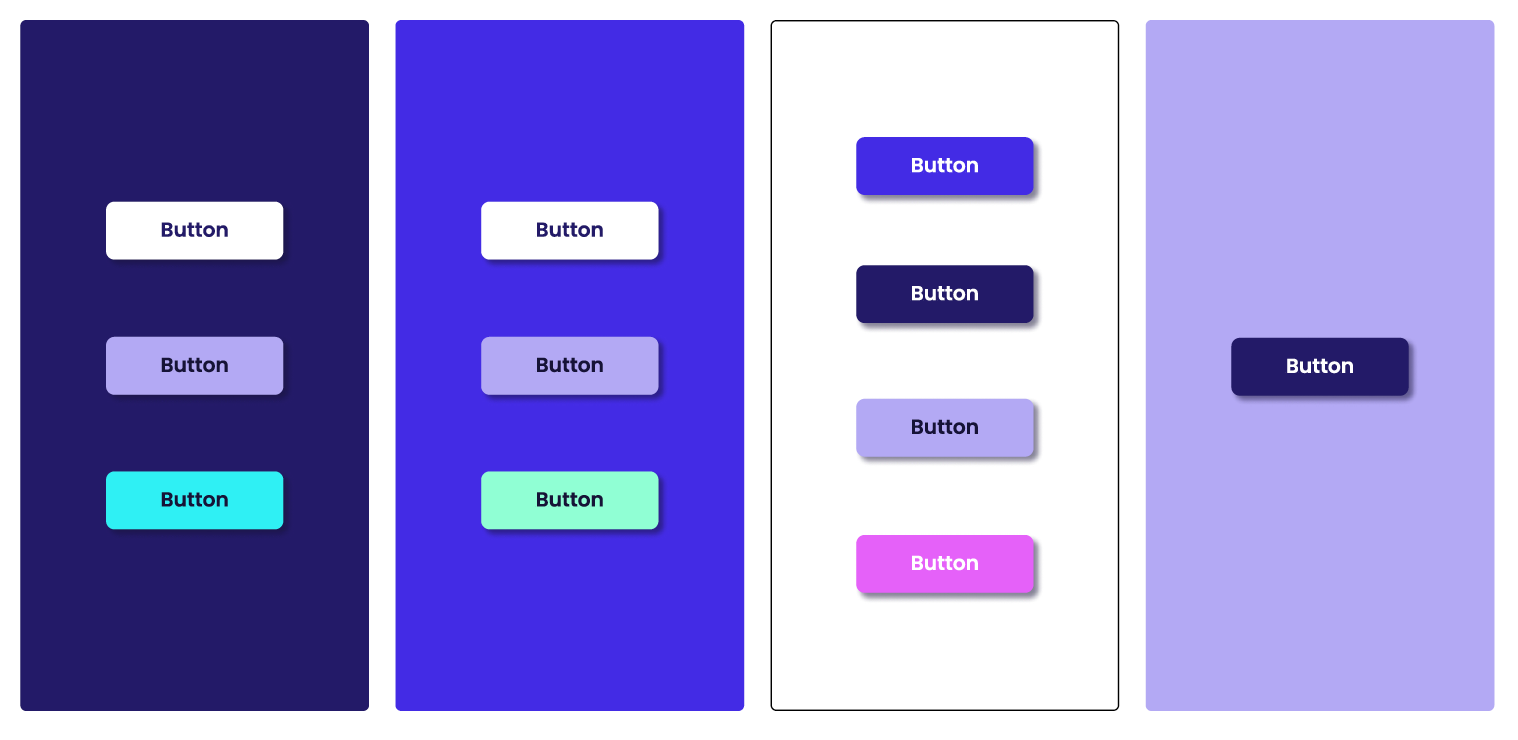
Button colour usage
When using a primary or secondary colour as the background, additional colours from any of the pallets may be used for burrows, provided they maintain a high level of contrast. A drop shadow should be added to all buttons! Dropshadow should be “Deep Blue” colour at 50% opacity. Position X and Y -4%. Blur radius -5.