Logo
In this section, we will dive into the heart of our brand identity – our logo. As a visual representation of our company, our logo carries the essence of who we are and what we stand for. It serves as a powerful symbol that communicates our values and establishes recognition. Here, we will explore the correct usage, variations, and guidelines for our logo, ensuring its consistent and impactful application across all brand materials. Download: logo files | symbol files
Marketing logo
Our logo consists of a distinct logo mark and complementary logotype. The logo mark captures attention with its unique symbol, while the logotype reinforces our brand name. Together, they create a cohesive and impactful representation of our brand.
Safe area
The safe area of our logo is a designated space that ensures its visibility and integrity by keeping other elements clear. It allows our logo to make a strong impact and maintain visual consistency.å
Minimum logo sizes
We define the minimum sizing requirements for our logo to ensure optimal visibility and legibility across various mediums.
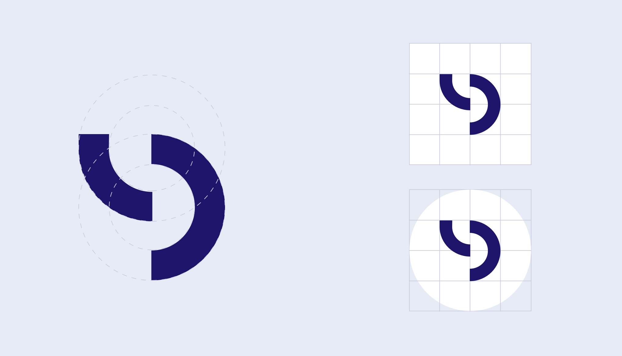
Symbol
The LeadDesk symbol combines two looping circles to create a geometric design featuring the LeadDesk monogram. With a subtle abstraction of a headset, the symbol reflects the company’s origins and identity.


Identity logo
The “Screen Blue” is the designated colour to be used when displaying the logo on screens, specifically in situations where only the logo is presented, such as social media avatars and profiles. This colour ensures optimal visibility and legibility in digital environments. However, in all other cases where the full brand representation is utilised, the primary colour “LeadDesk Blue” should be used.


Logo colours
The colours used in our logo are carefully chosen to represent the essence and identity of our brand. The primary logo colours consist of a bold and vibrant “LeadDesk Blue” and “Screen Blue” that symbolises trust, reliability, and professionalism.
Leaddesk blue
#1E156A
RGB:30,21,106
C:100 M:96 Y:36 K:33
screen blue
#432EEA
RGB:67,46,234
white
#ffffff
RGB:255,255,255
Dos and don’ts
The LeadDesk logo serves as the core element of our brand identity. Any deviation from the brand guidelines may lead to miscommunication of our company’s values and brand strategy. It is essential to adhere to the guidelines to maintain the integrity and consistency of the LeadDesk brand.
Dos
When using the logo, it is important to utilise the main brand colours as the background. Pay close attention to the contrast between the logo and the background to ensure optimal readability and visibility. By considering these factors, we can enhance the legibility and visibility of our logo in various contexts.
Don’ts
It is crucial to refrain from making any modifications to the logo. Please avoid using accent colors as the background for the logo. By adhering to this guideline, we can maintain the integrity and consistency of our logo’s design.