Typography
Typography is a key element in conveying our brand's personality and delivering a clear message. Here, we will explore our carefully selected typefaces, font sizes, and spacing guidelines. By adhering to our typography guidelines, we ensure consistency and coherence across all digital textual elements, creating a cohesive and engaging brand experience.
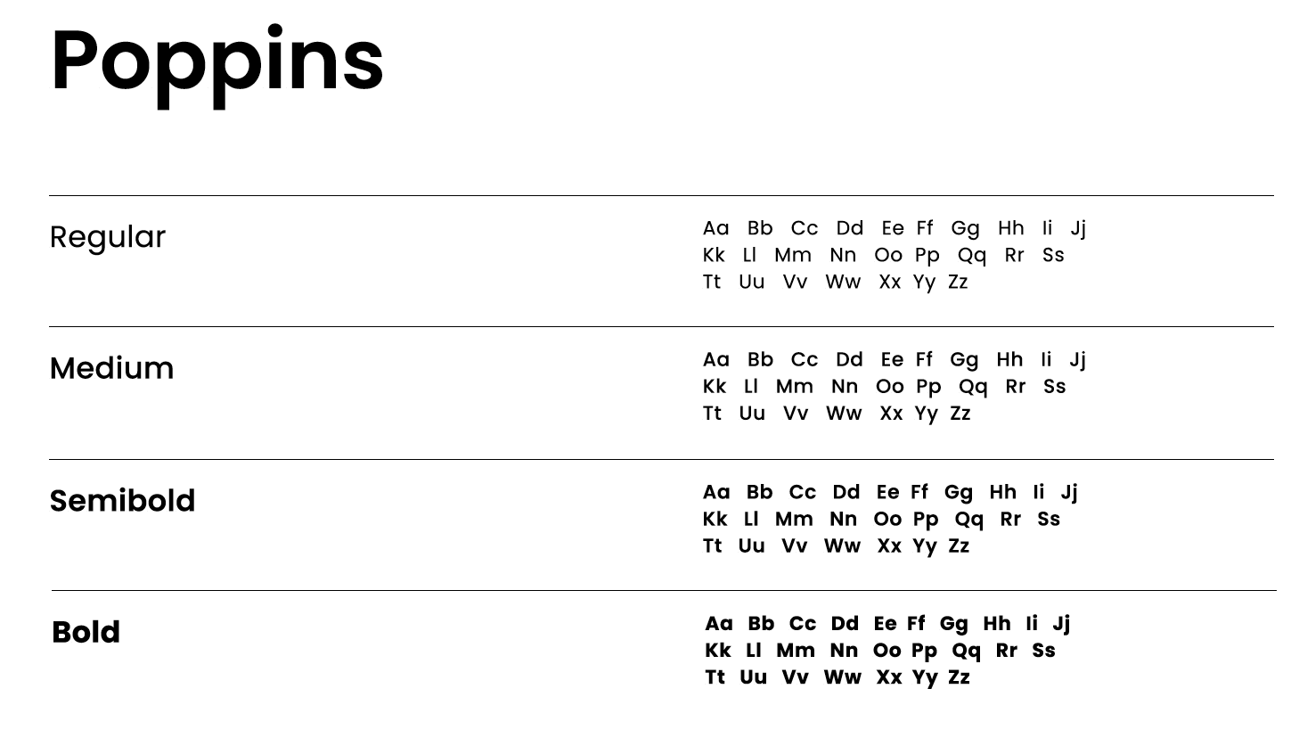
Type stack
The sans serif “Poppins” serves as the primary font for LeadDesk, embodying our brand’s visual identity with its modern and versatile characteristics.
Download Poppins | Download Material Icons
Hierarchy
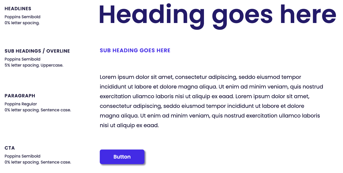
“Poppins” serves as the primary font for LeadDesk. Text are primarily left-aligned as long as the design lends for it. Otherwise, text can be centered.
Colour in typography
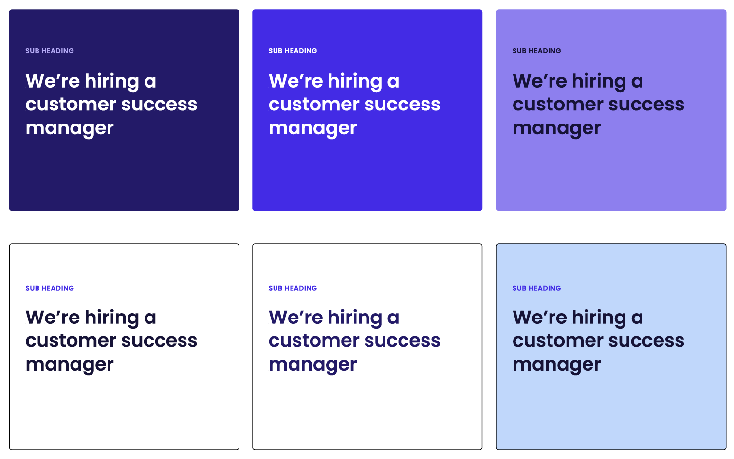
The colours used in typography are carefully chosen to ensure optimal legibility and visual harmony within the LeadDesk brand.
Deep blue
#0F0B35
RGB: 15,11,53
Headings, button, overline
Shadow blue
#514B69
RGB: 81,75,105
Paragraph, caption, chips
Screen Blue
#432EEA
RGB:67,46,234
Links, Navigation active
White
#FFFFFF
RGB: 255,255,255
When contrast allows
Colour examples
We provide examples on how to effectively pair typography colours to create visually appealing and cohesive combinations within the LeadDesk brand guidelines.
Incorrect colour examples
These colour combinations are not allowed, as they compromise legibility.
